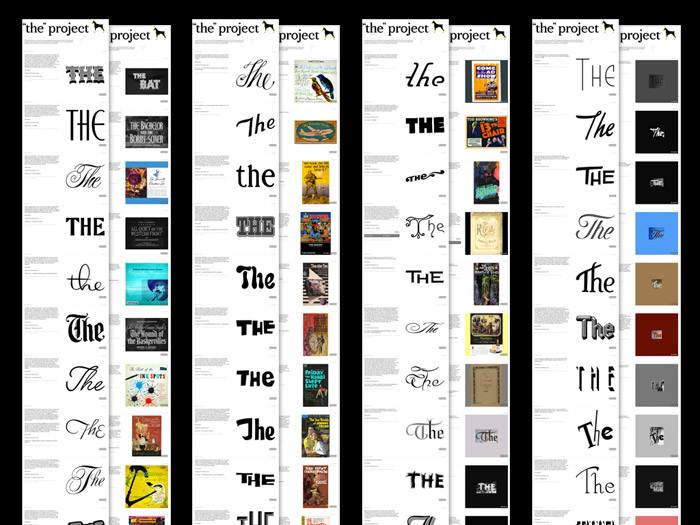
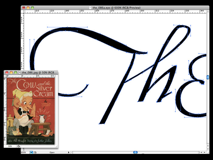
A QUICK NOTE: My old lettering hobby, The “The” Project, has been resuscitated as a charitable font of 126 “The” wordmarks after years of lying fallow.
See more, or give $5.00 to get a font, some SVGs, and a (PDF) book:
>>> etsy.com/shop/thetheproject <<<


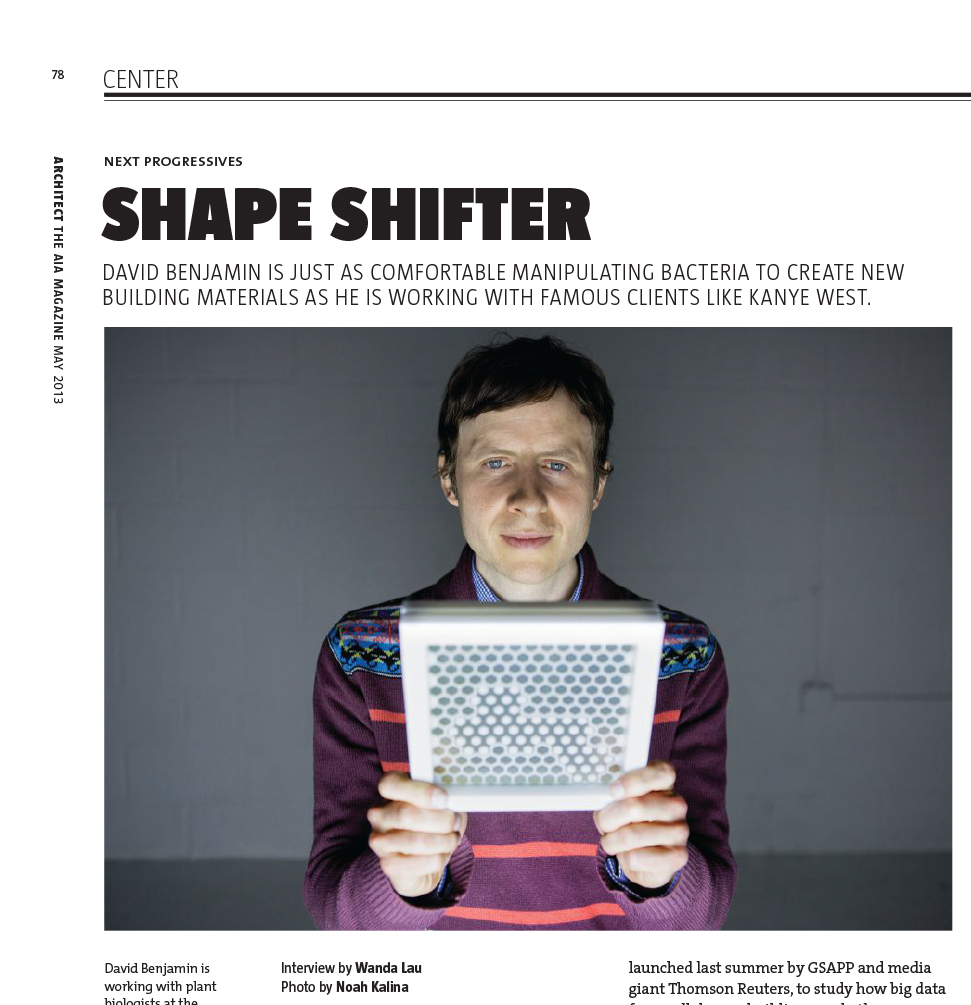
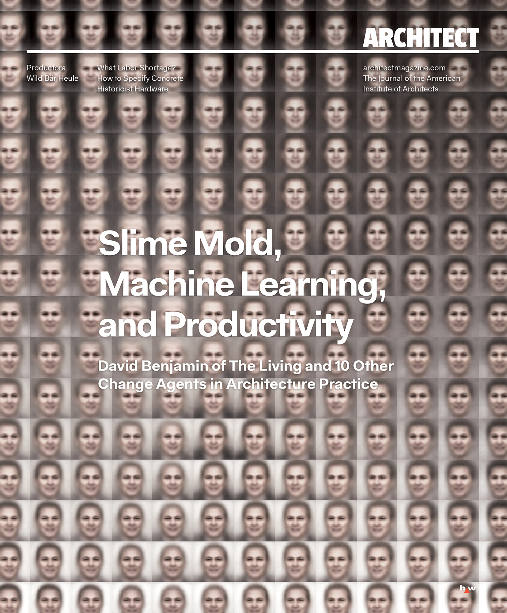

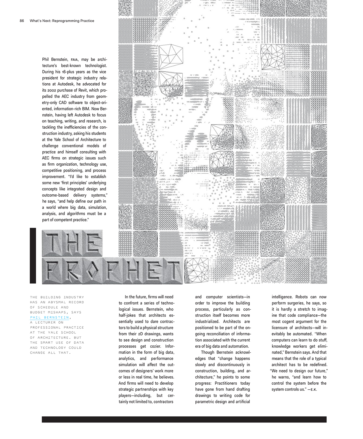

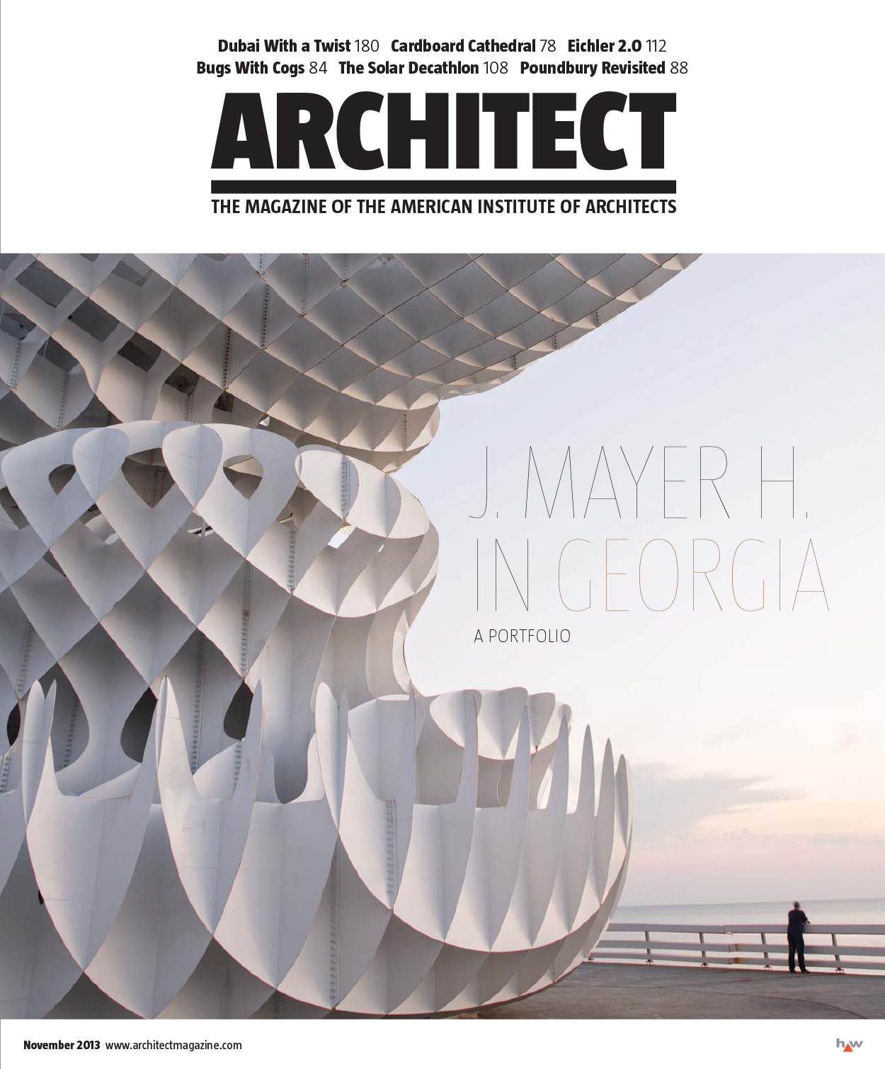
AN ANECDOTE: Architect David Benjamin’s portrait was an early assignment. He graciously put up with my “benevolent mad scientist” photo direction. Poor form—his good-weird work deserved better. In 2018, Benjamin’s research into algorithmic design was our cover feature on “Reprogramming Practice.” Disruption, technology, new business models, whatnot. Second-chance improvements: simple portrait, expression his own, honest lighting. Kismet of a good photographer pairing his stripy sweater with his stripy building. Add two flavors of monospace fonts for science’s sake and headline lettering based on his work. Benjamin was first of 10 profiles, without budget or time for matching portrait shoots. No willpower to run inconsistent pick-up headshots. On-theme generative plotter portraits were cheap enough to guiltily cross the illustration picket line. We embraced bots—reprogrammed our practice. Disparate parts were uniformed-up with bonus 3D-printed headlines.


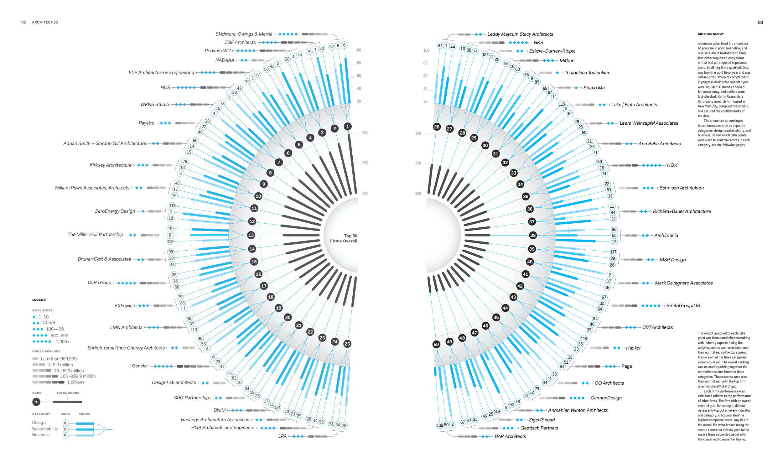
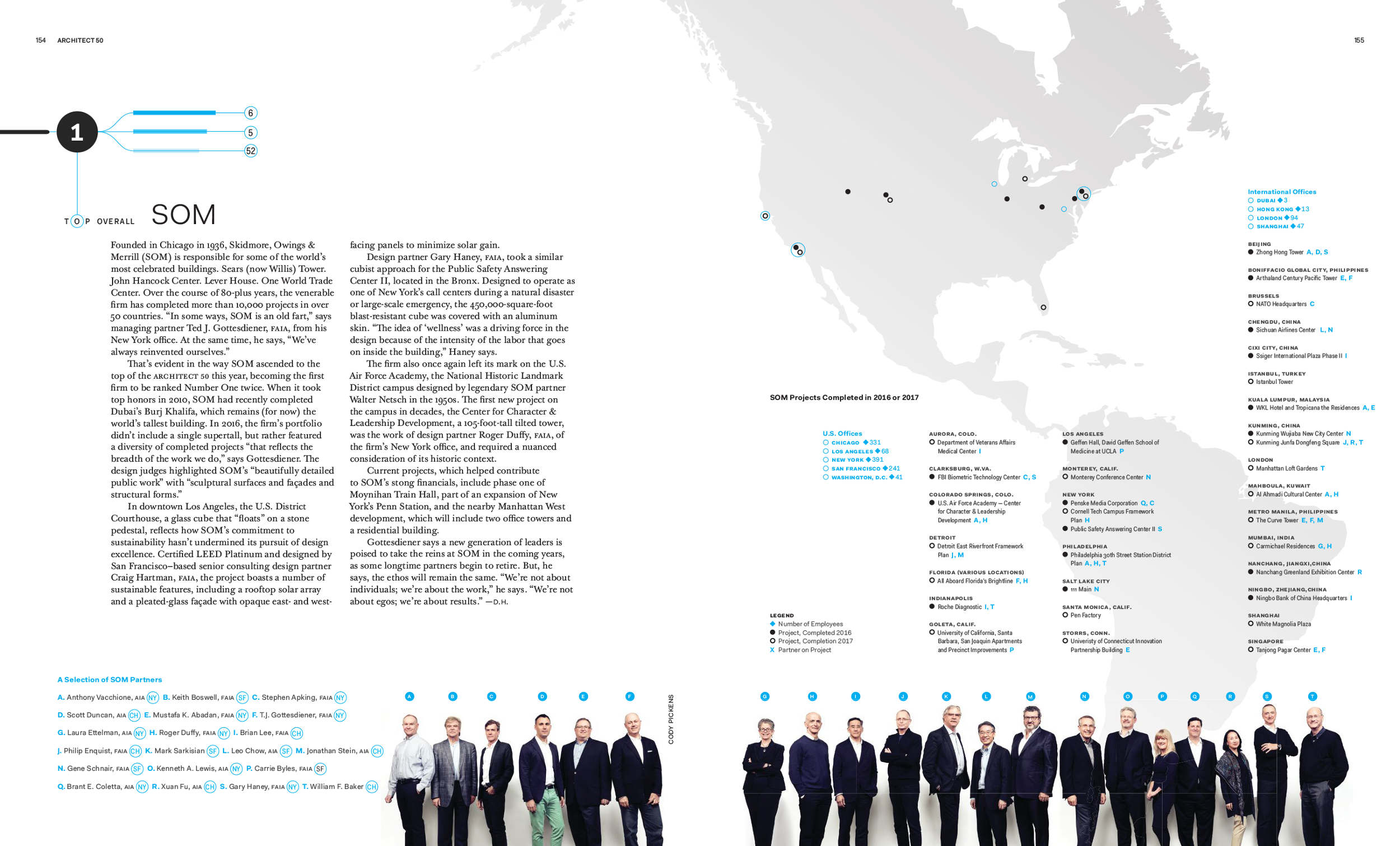
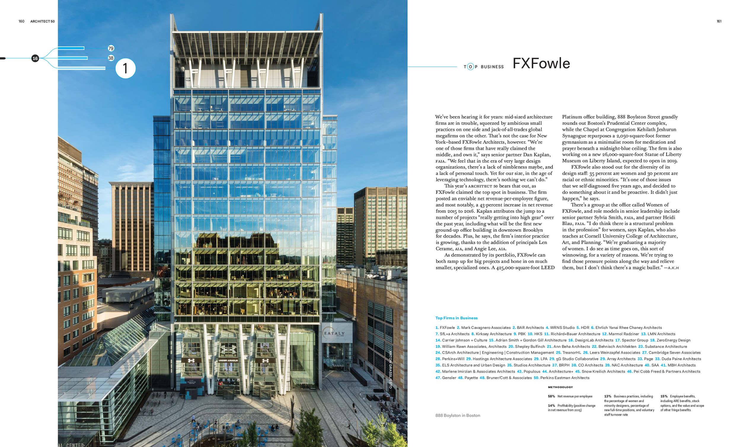
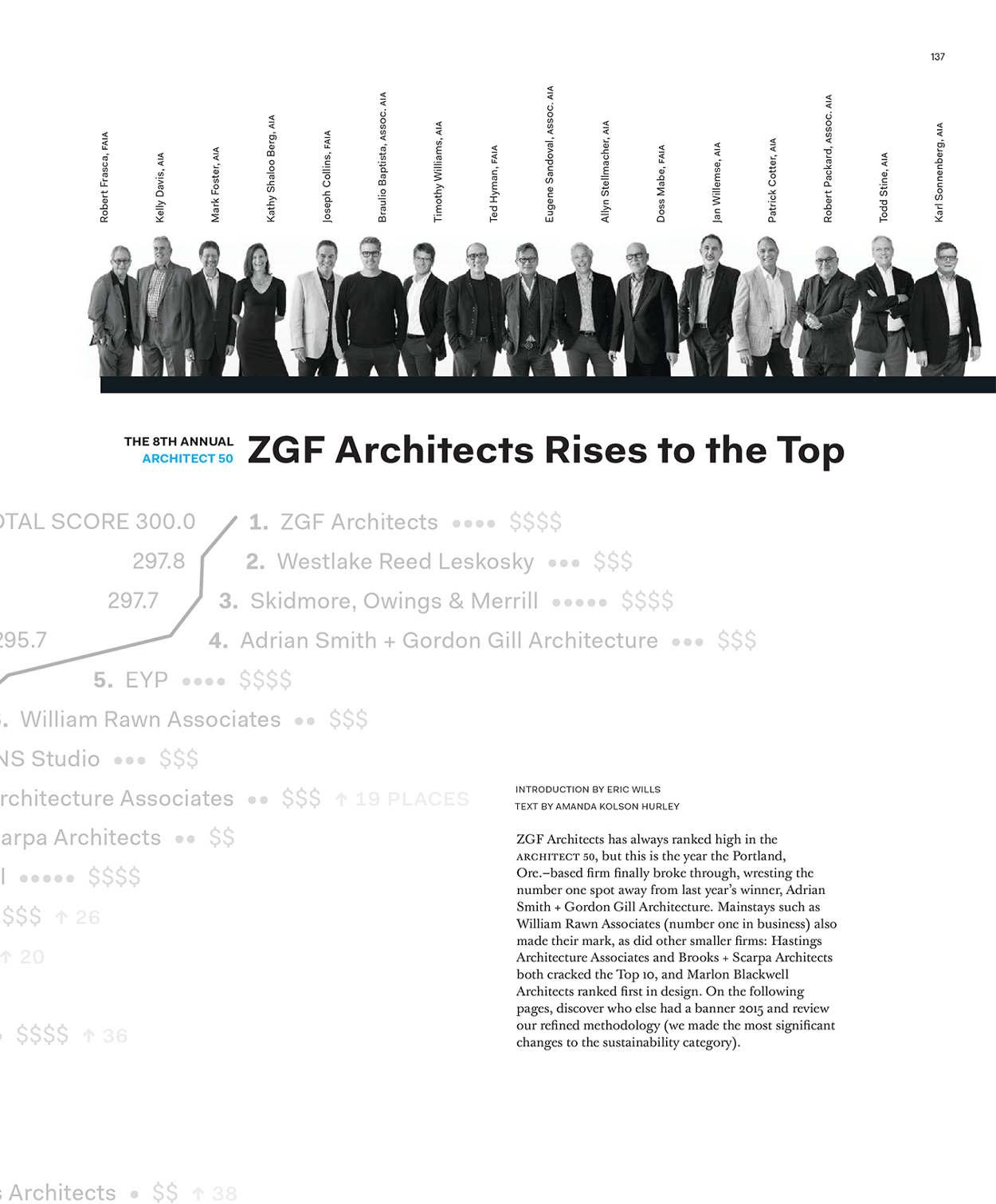

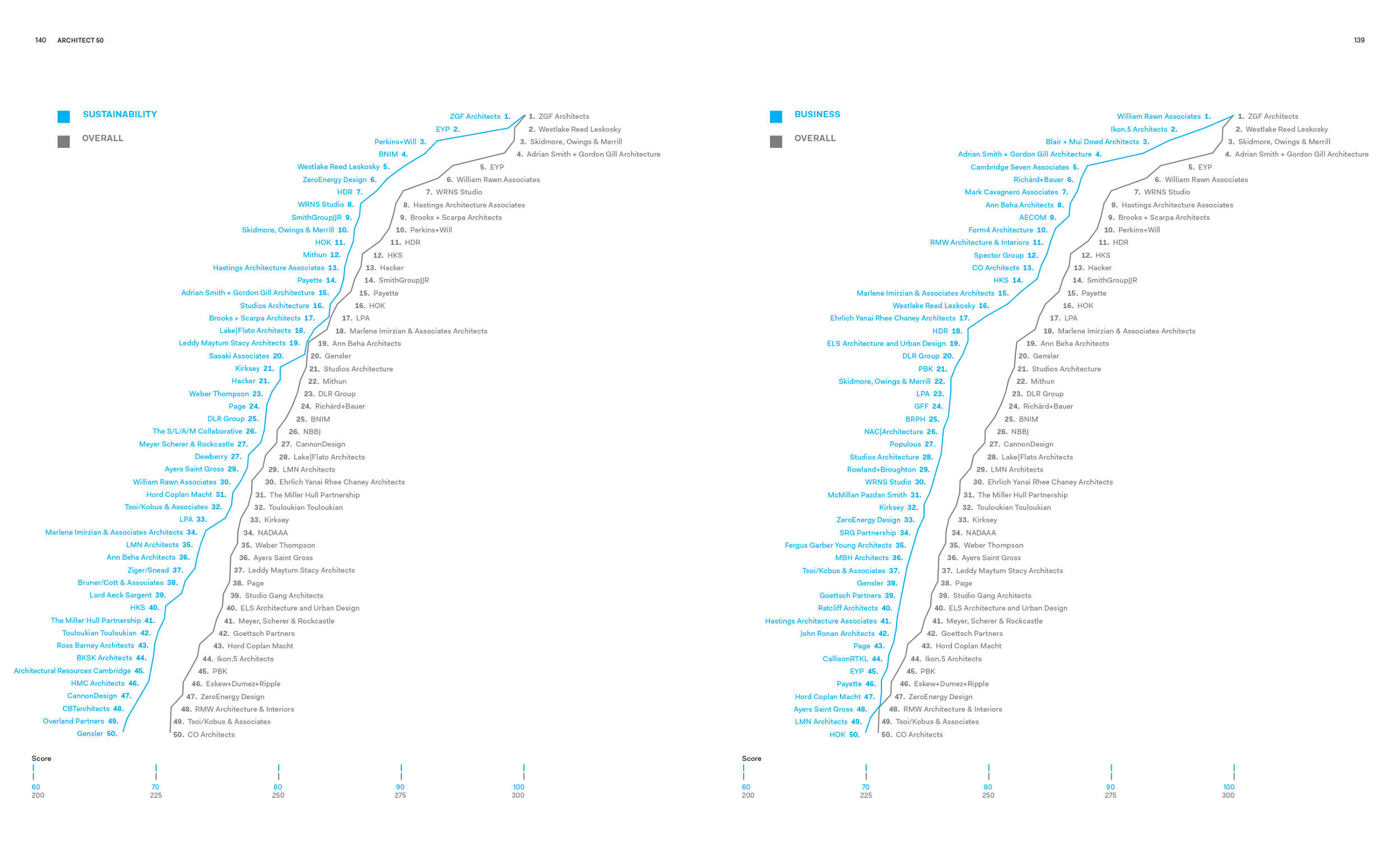

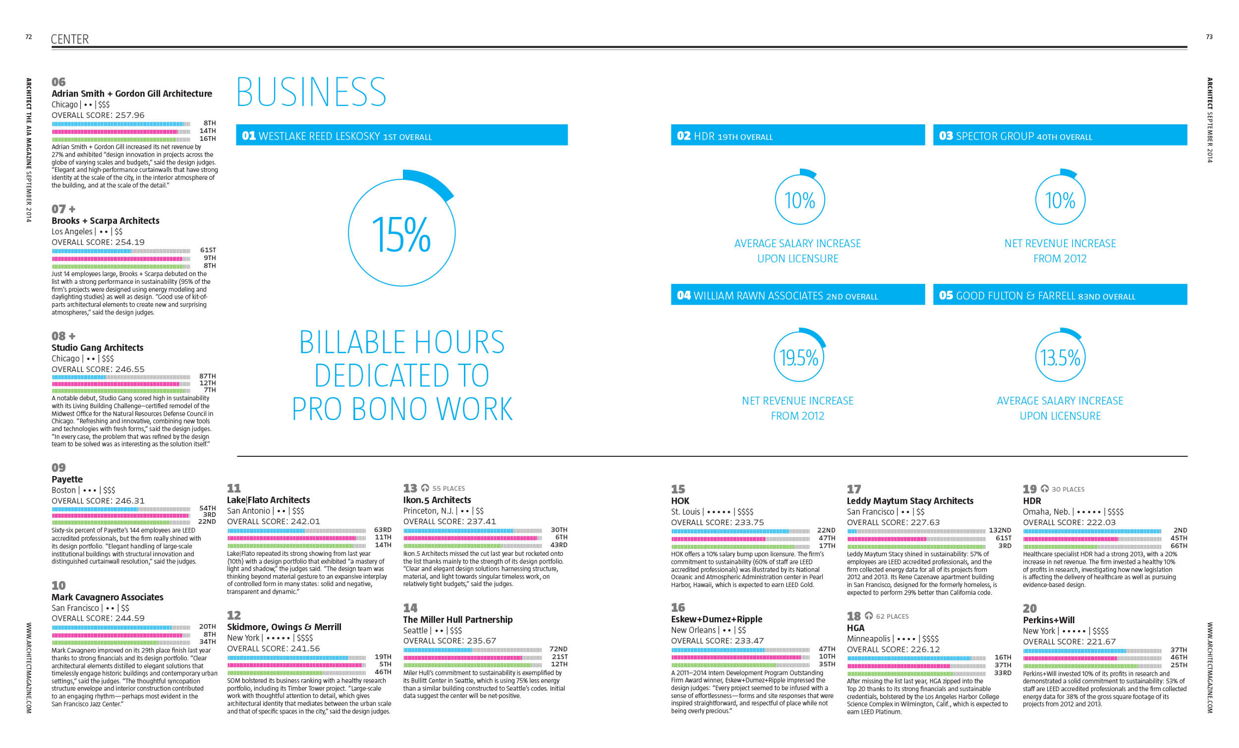
These annual rankings of the best U.S. firms are created using criteria more interesting than: “Who makes the most money?”. It’s a data visualization package with the stubborn yearly challenge of showing the same content in new ways.
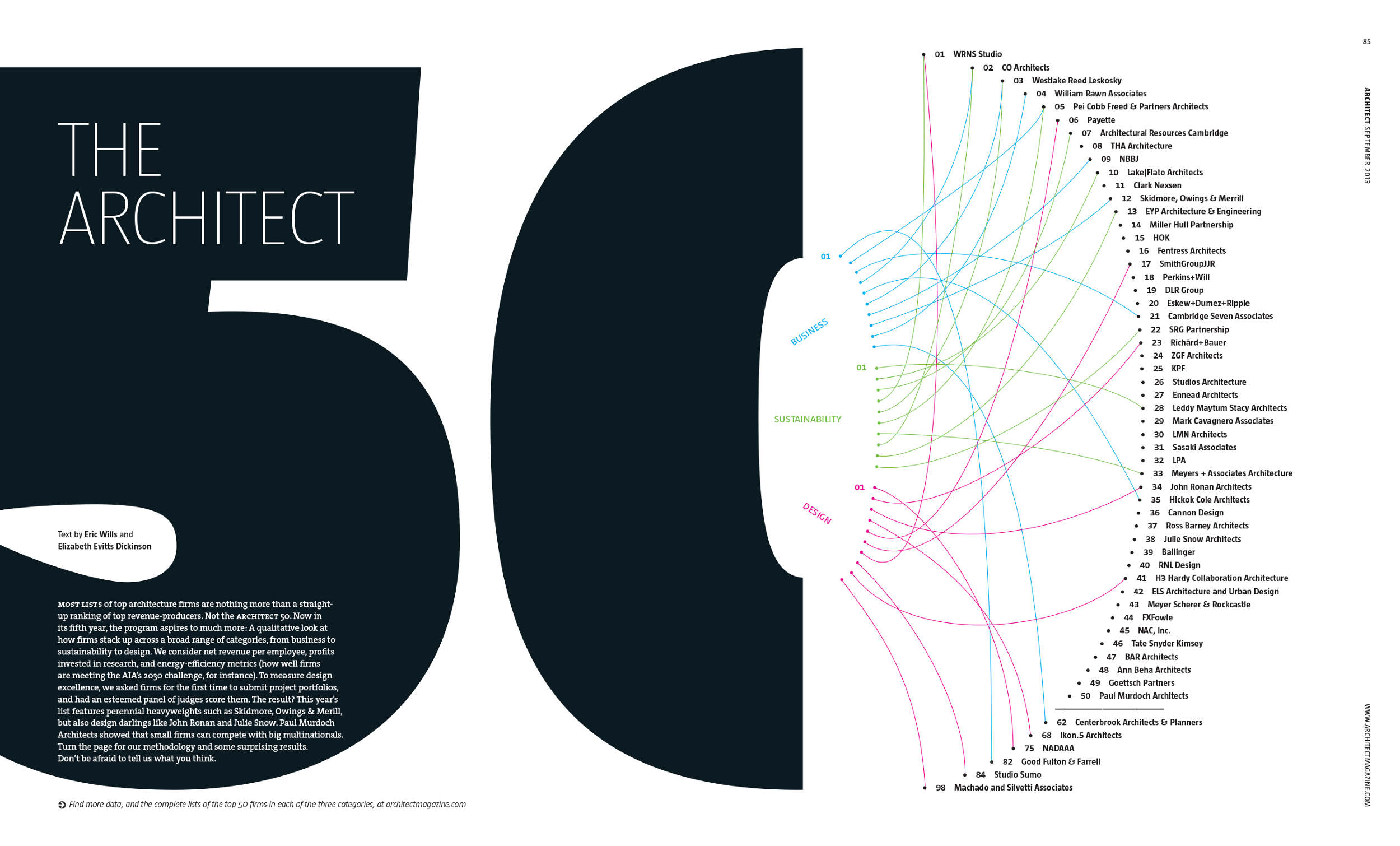
Densely complicated chart from the 9th year by Sara Piccolomini.
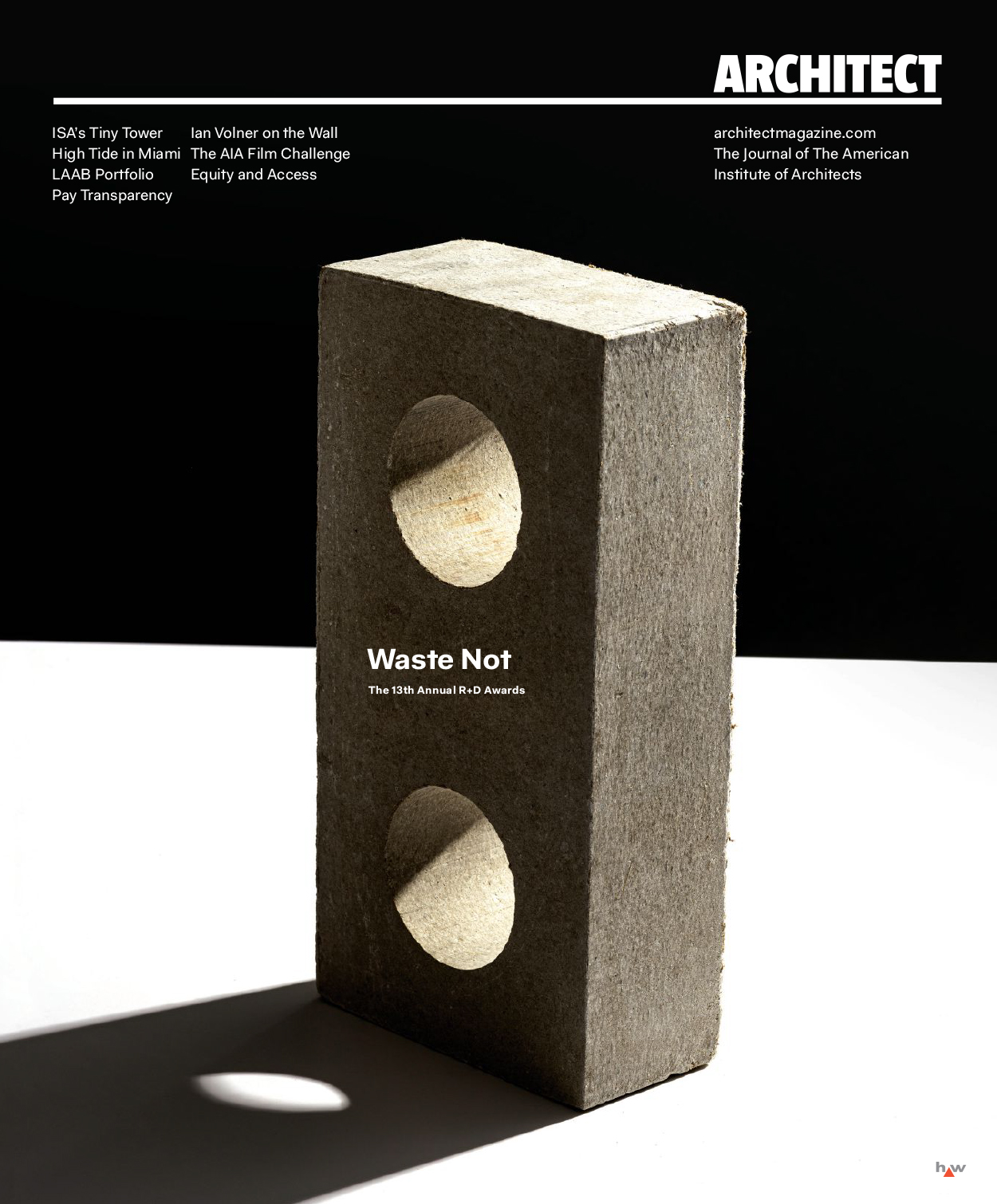
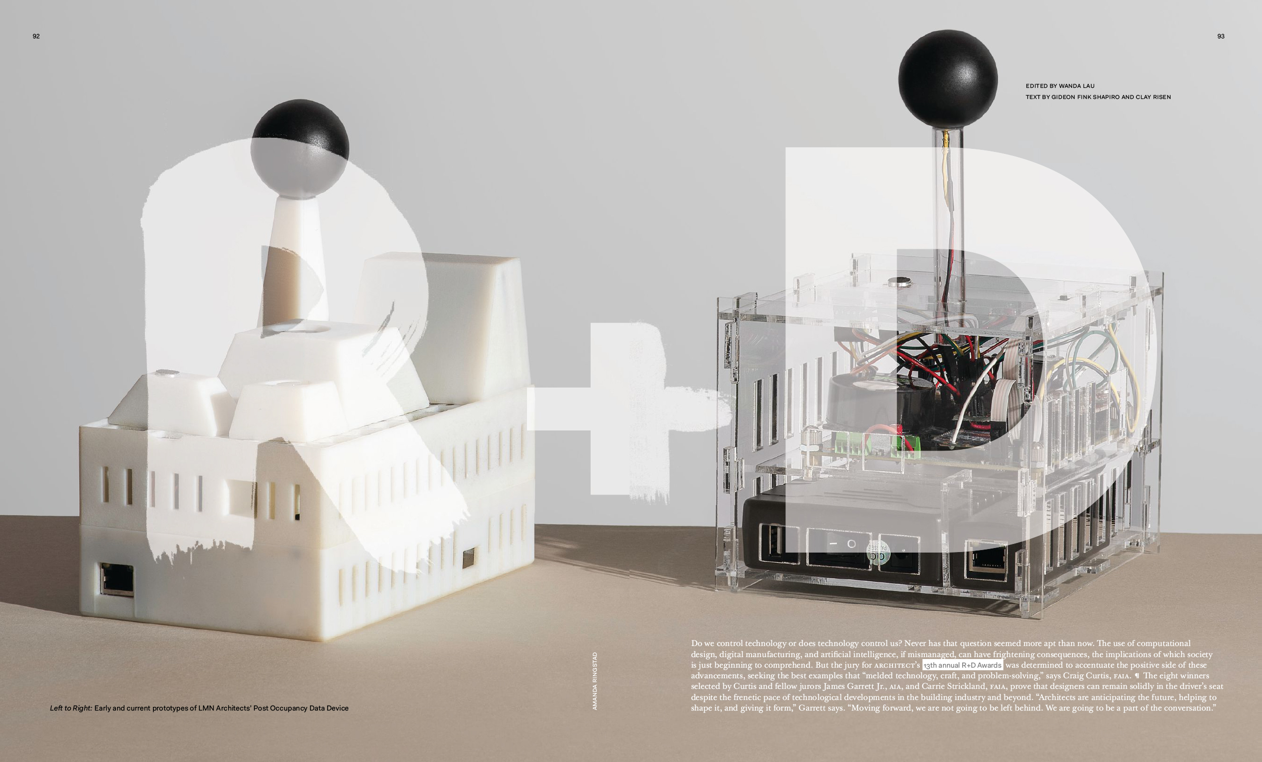
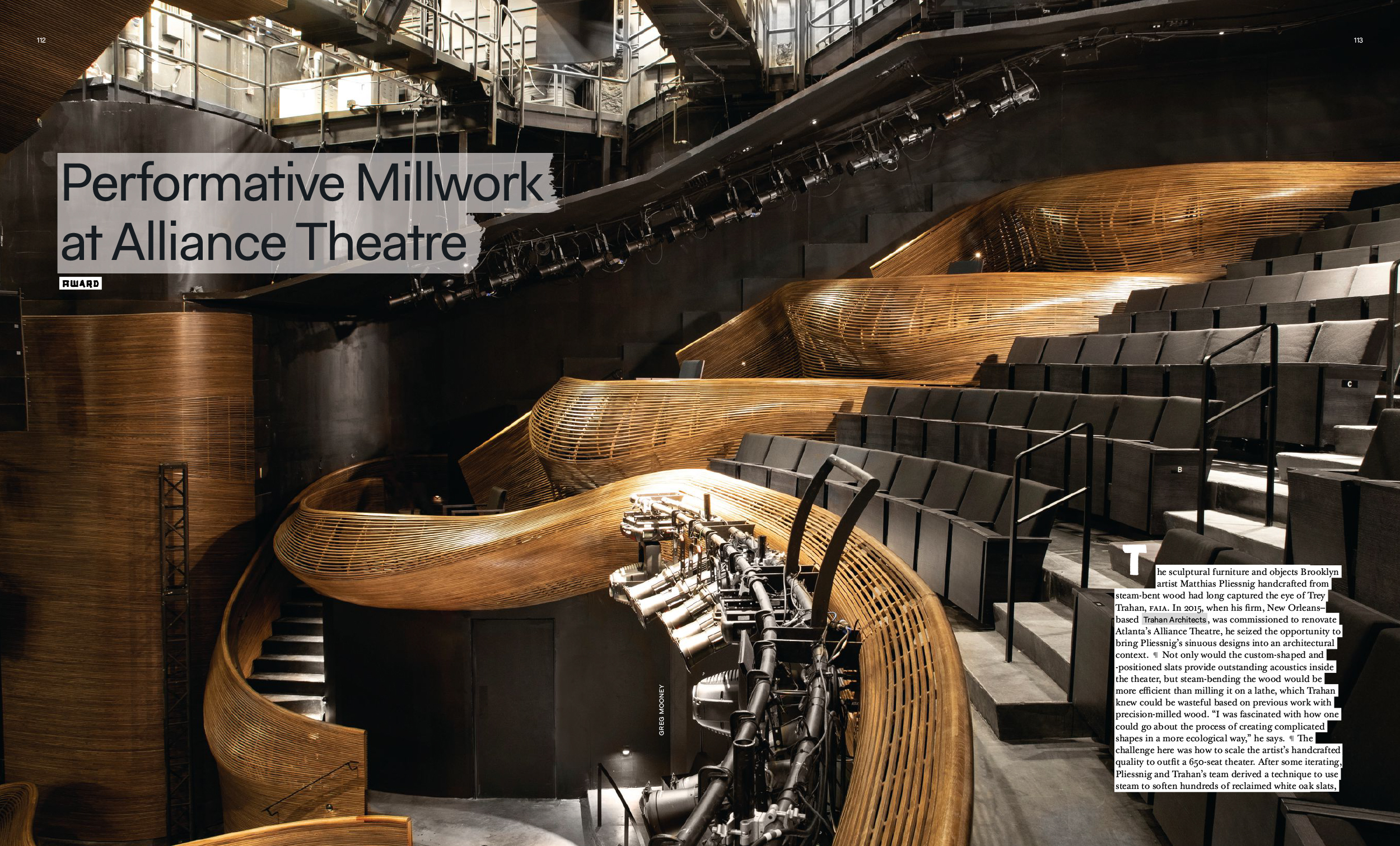
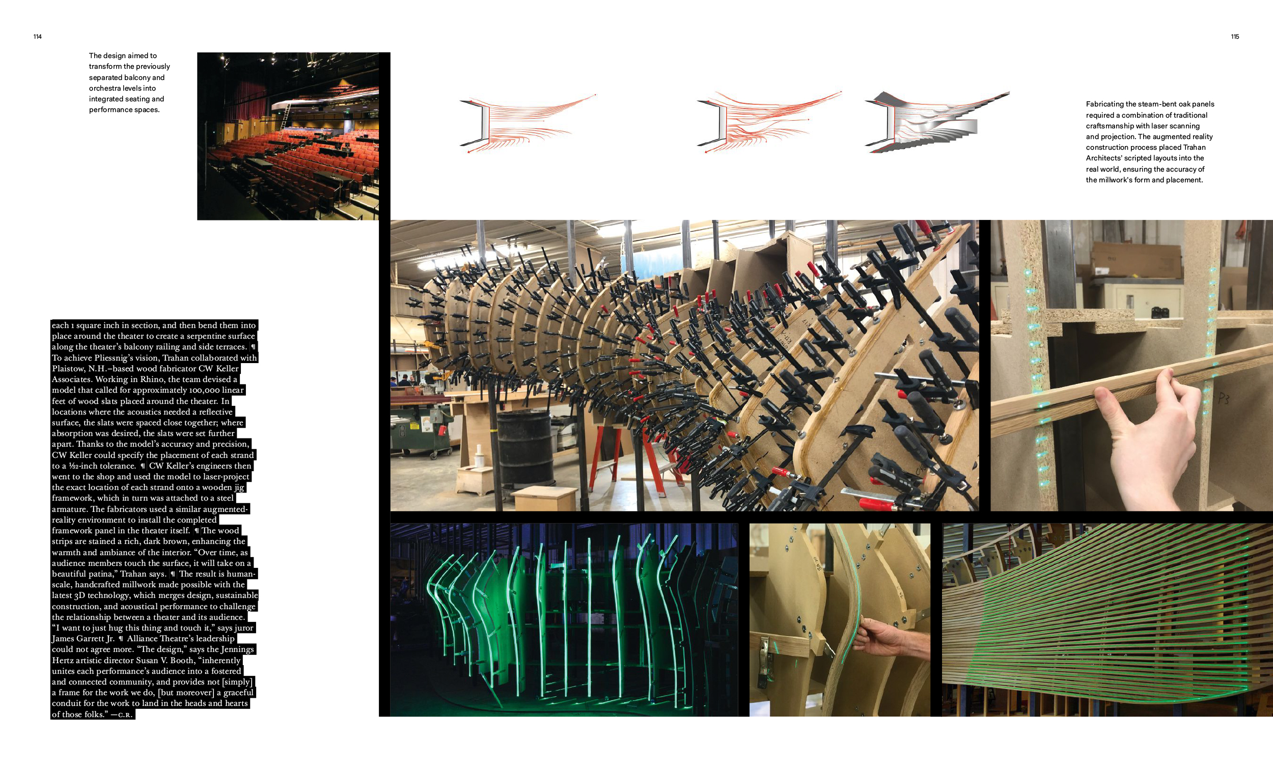
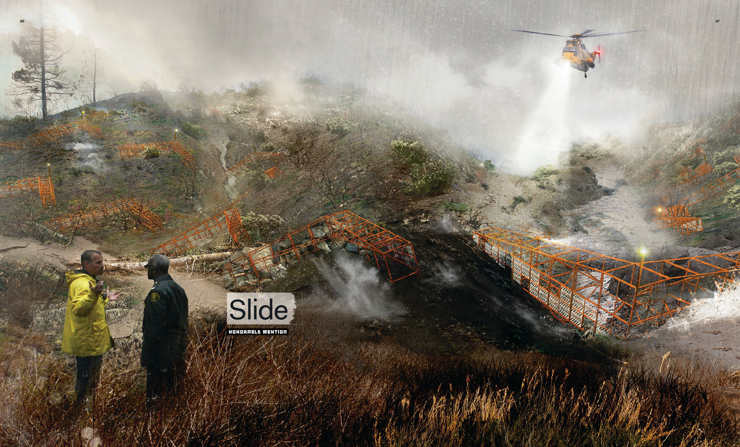
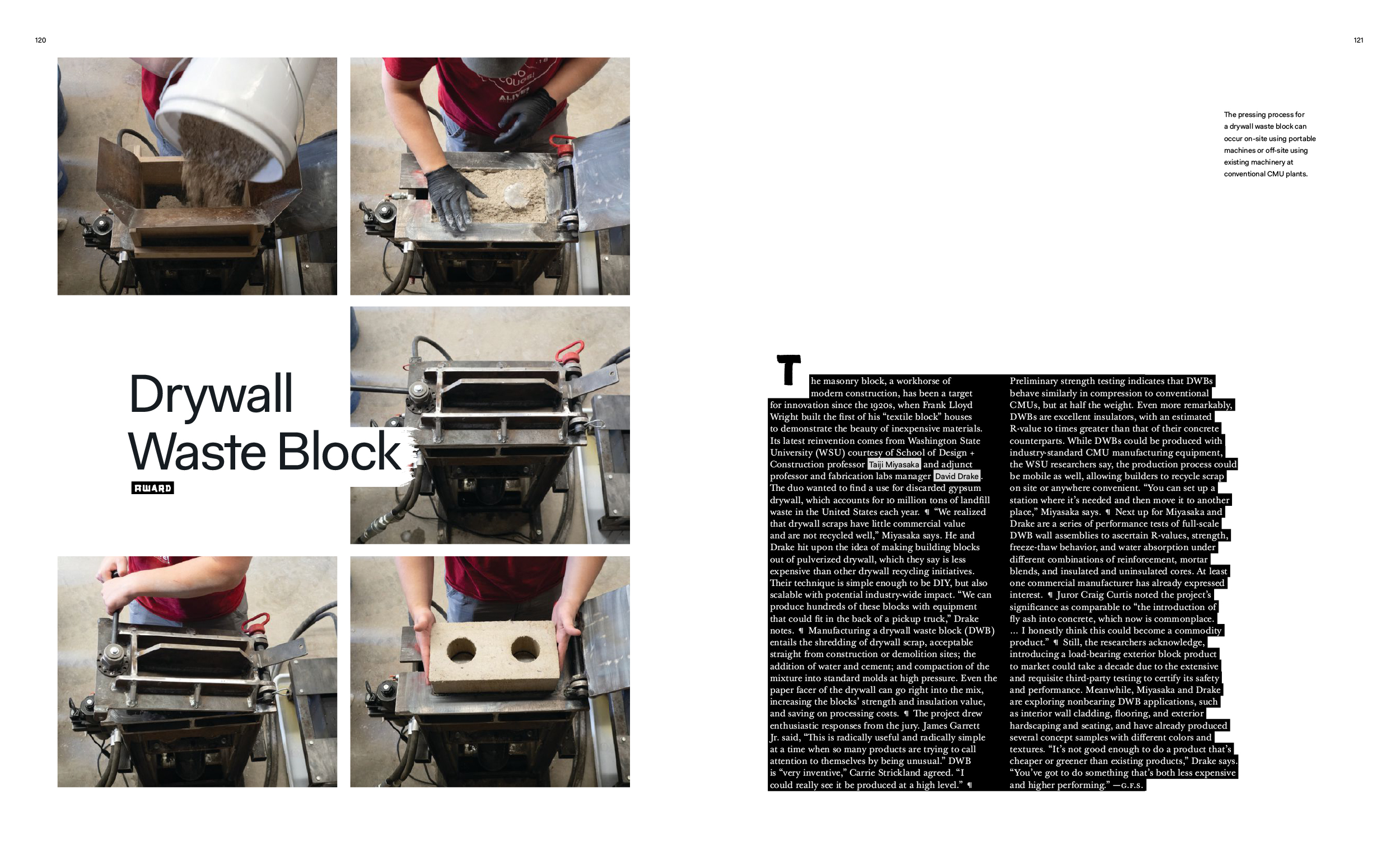
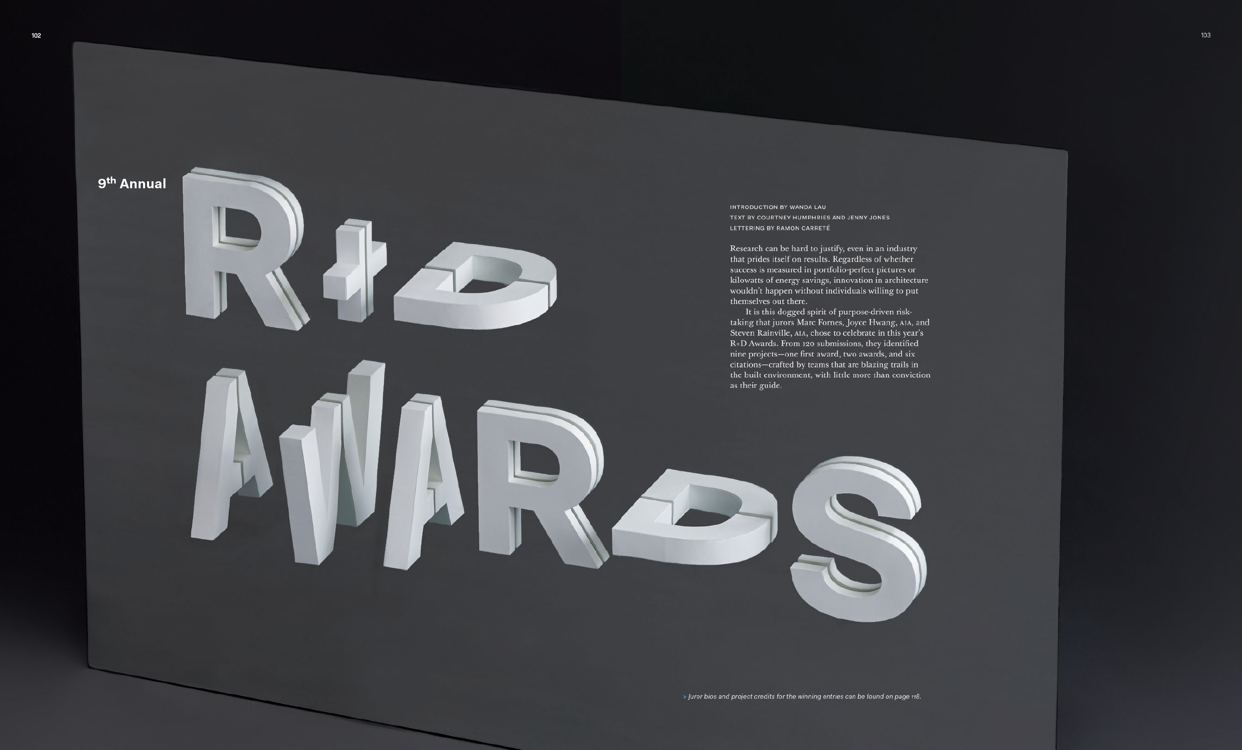
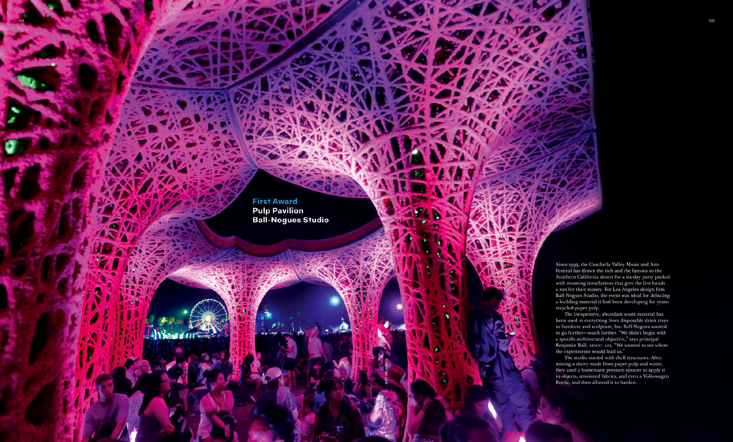
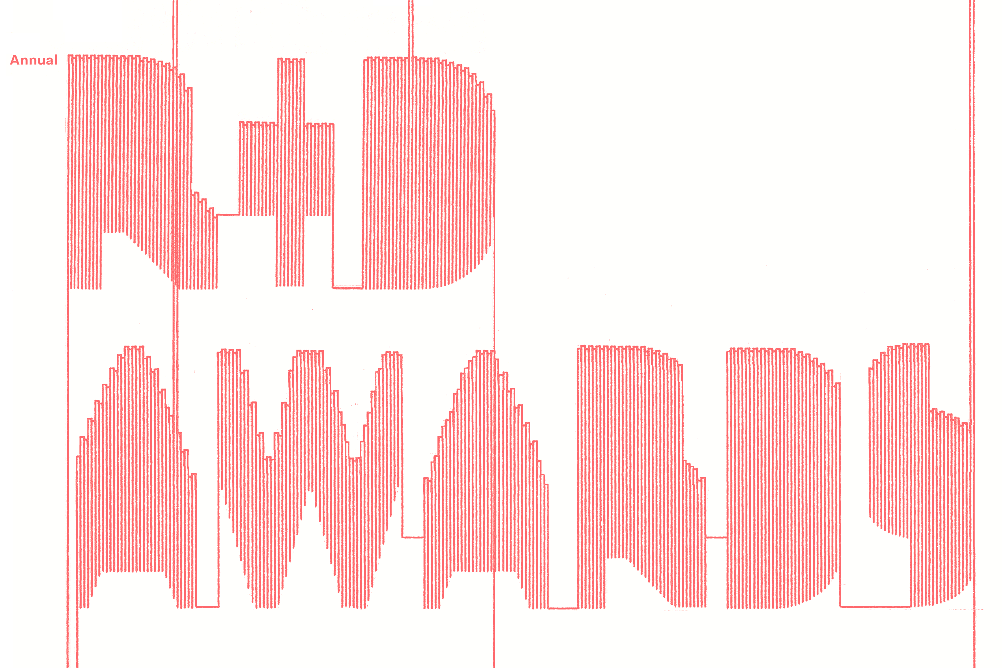
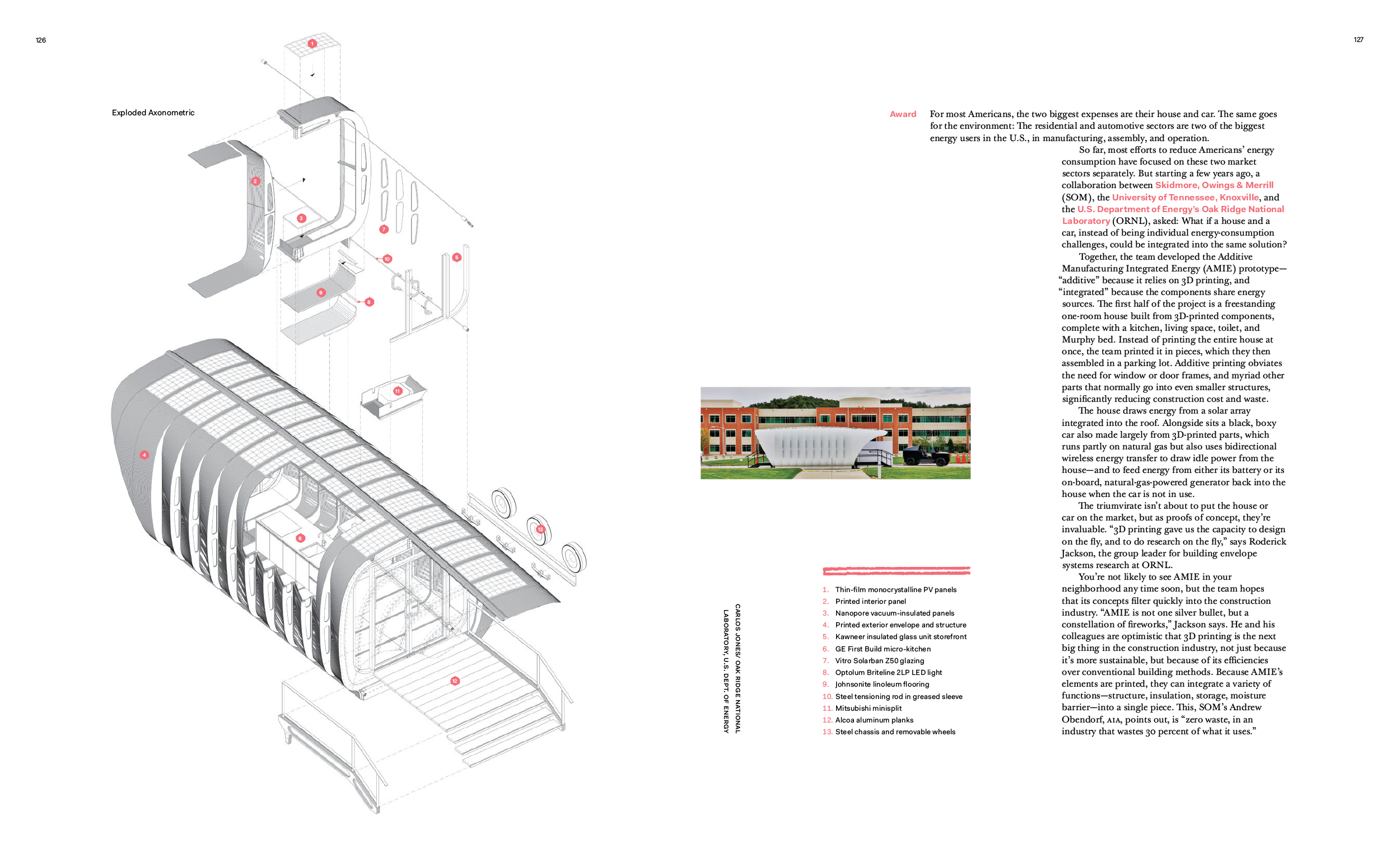

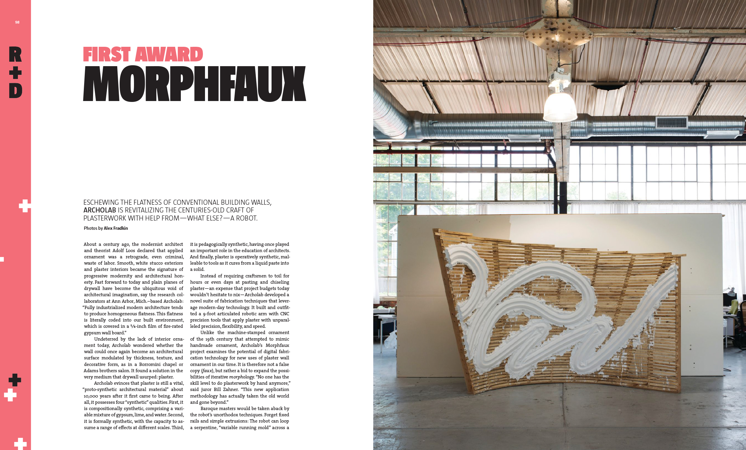
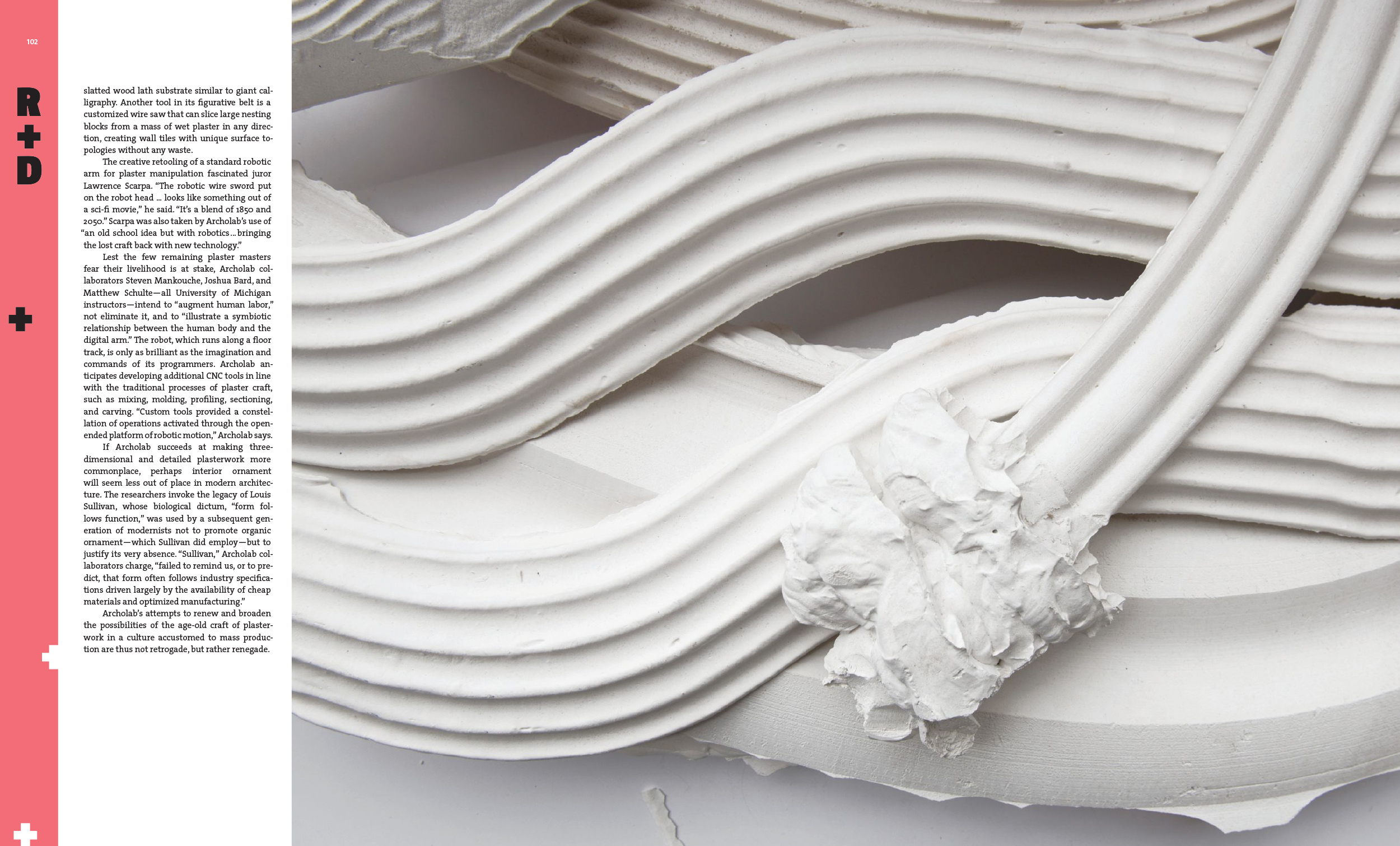
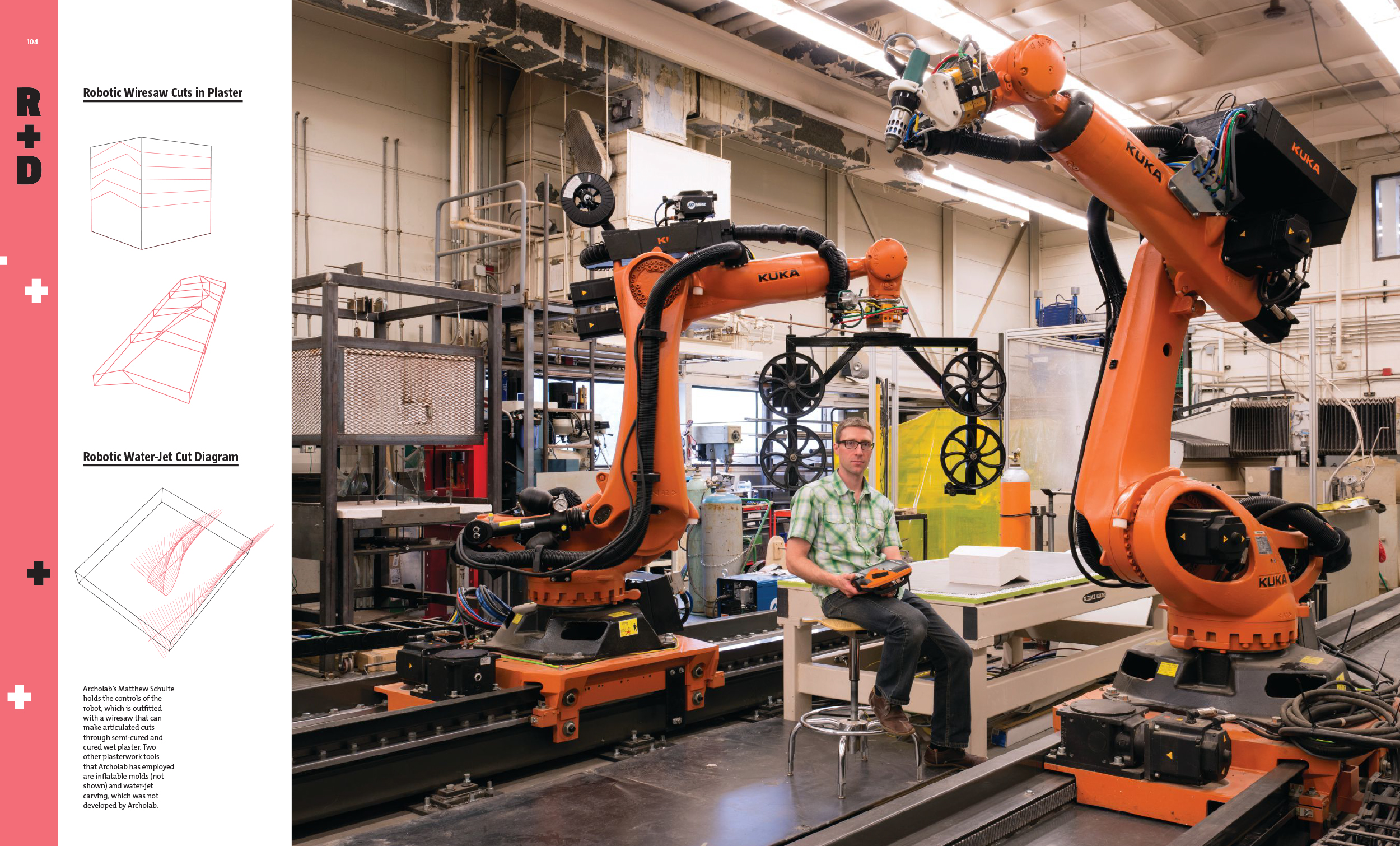


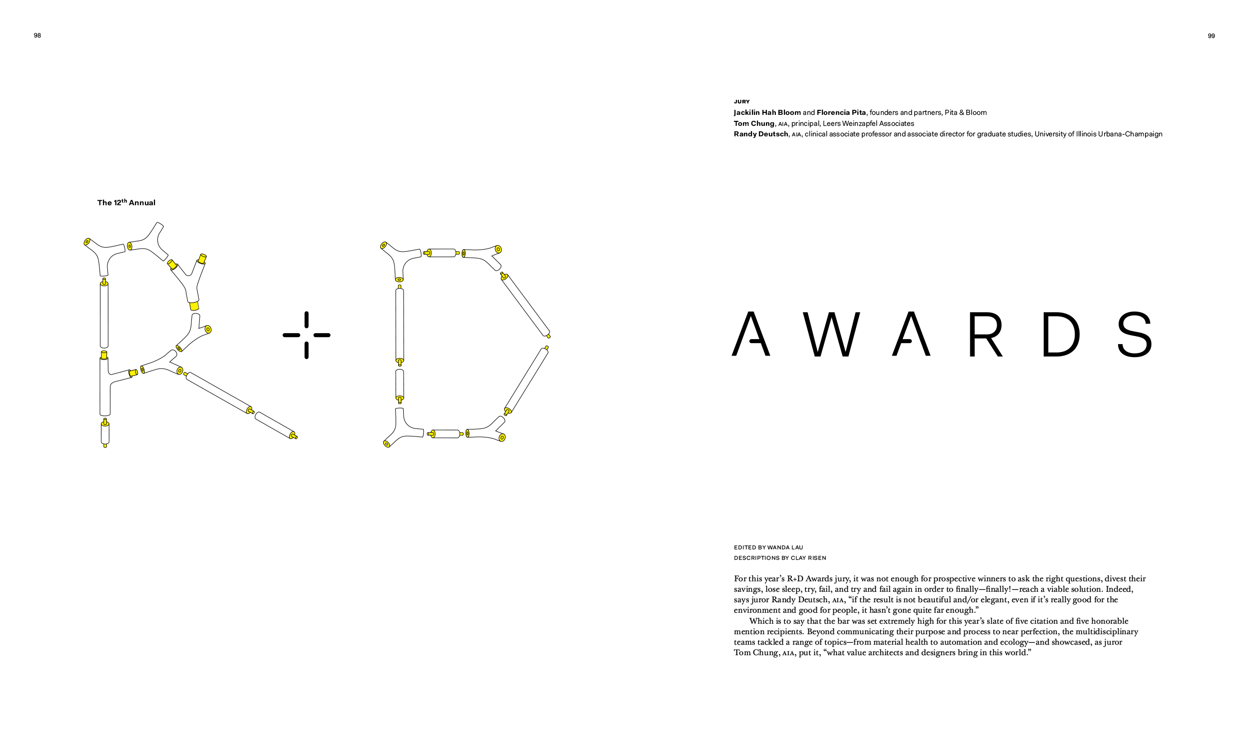
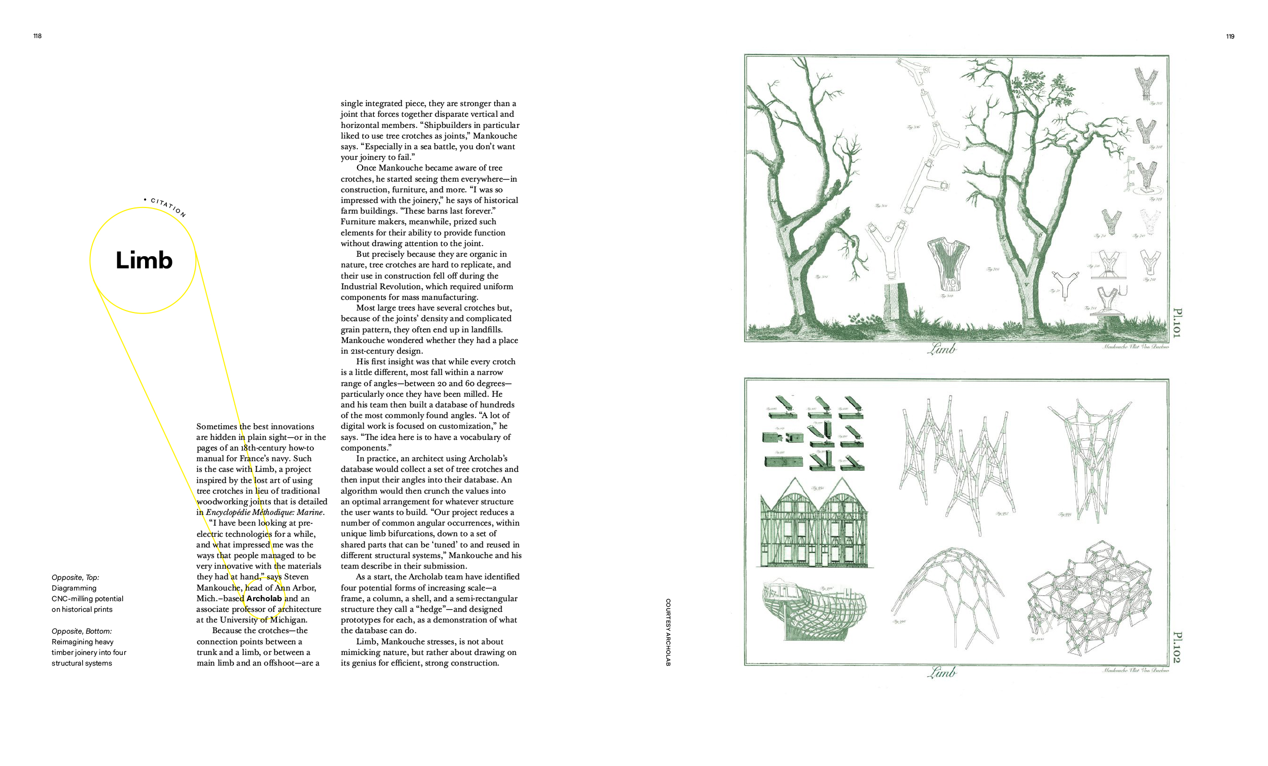
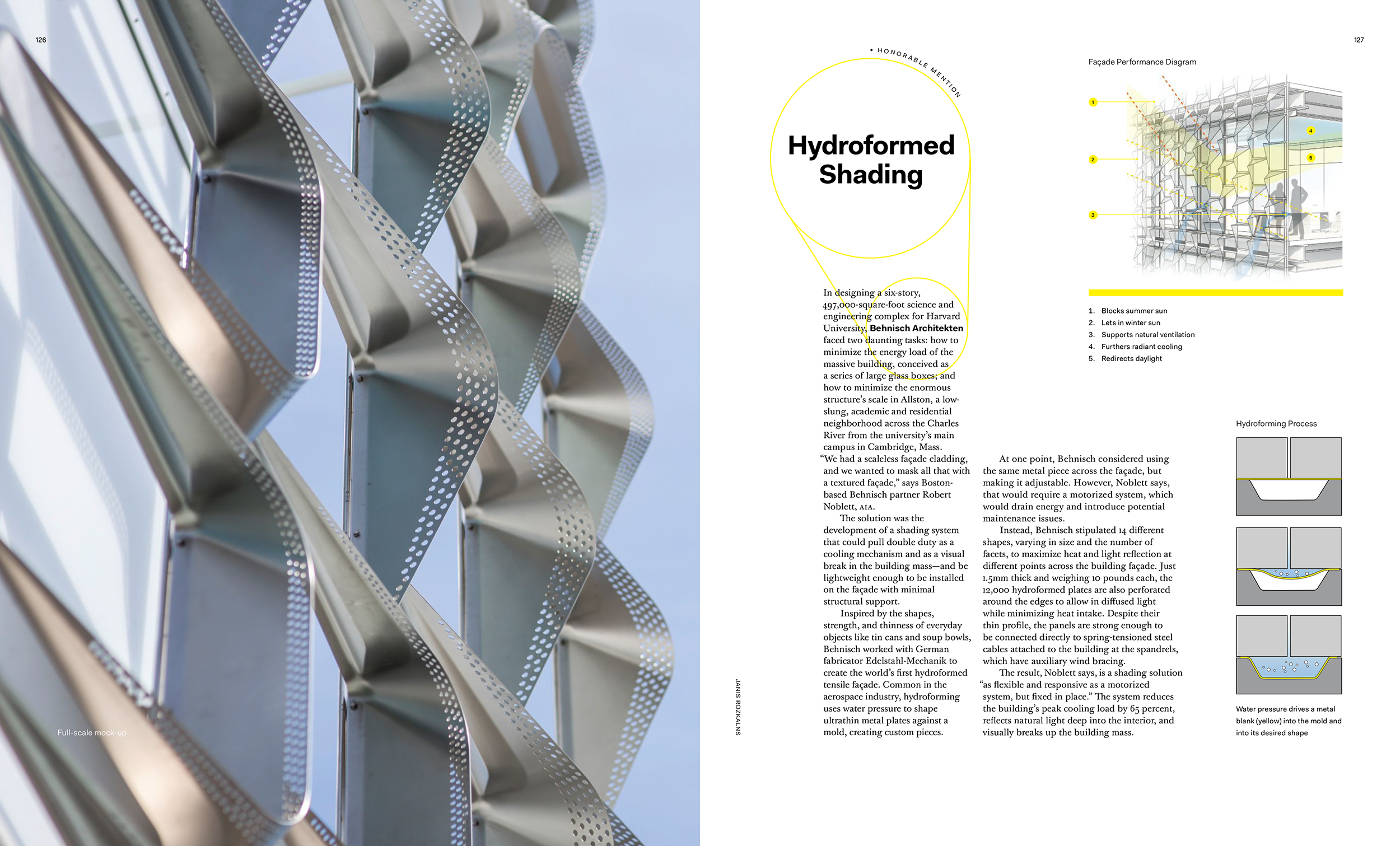
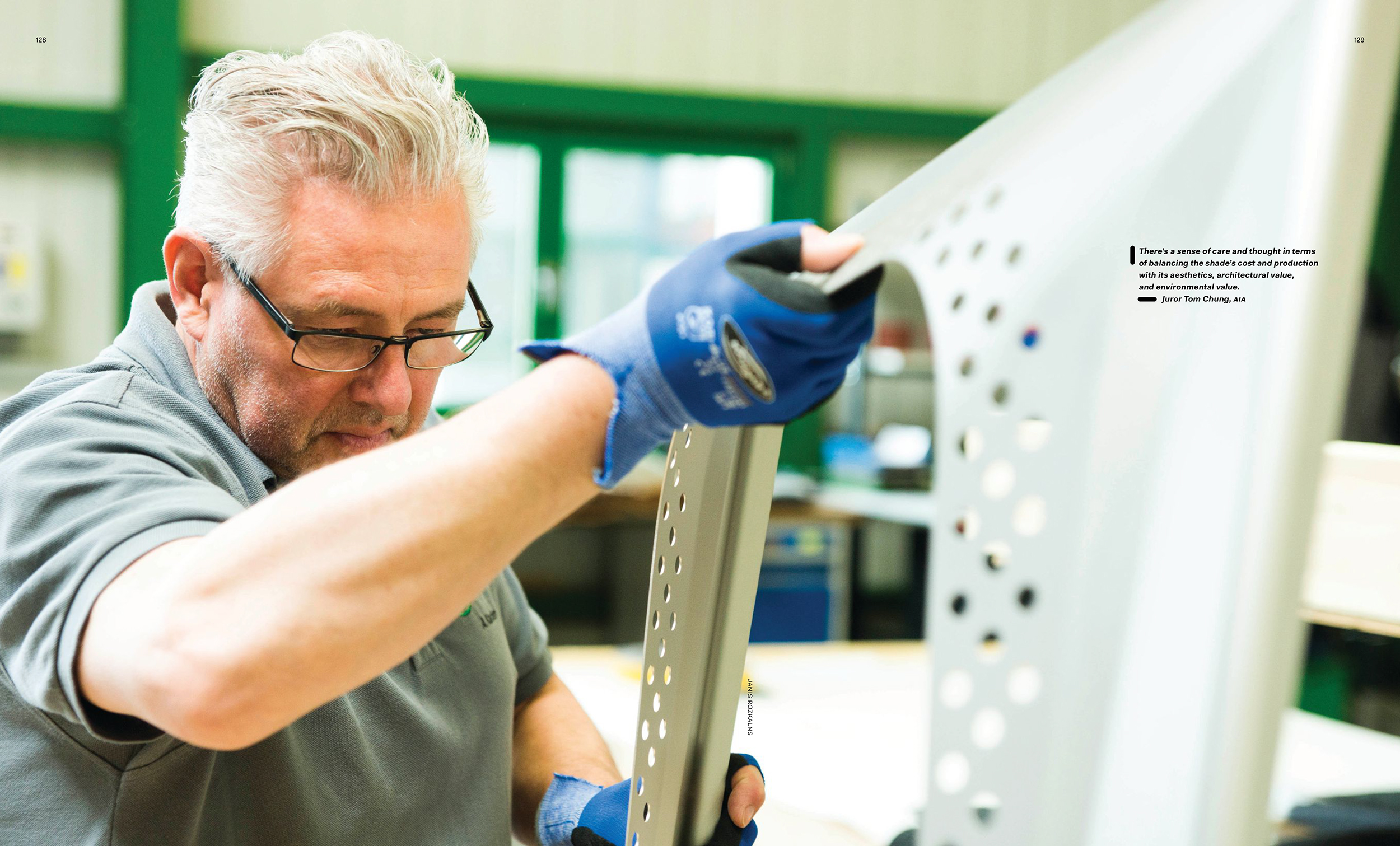

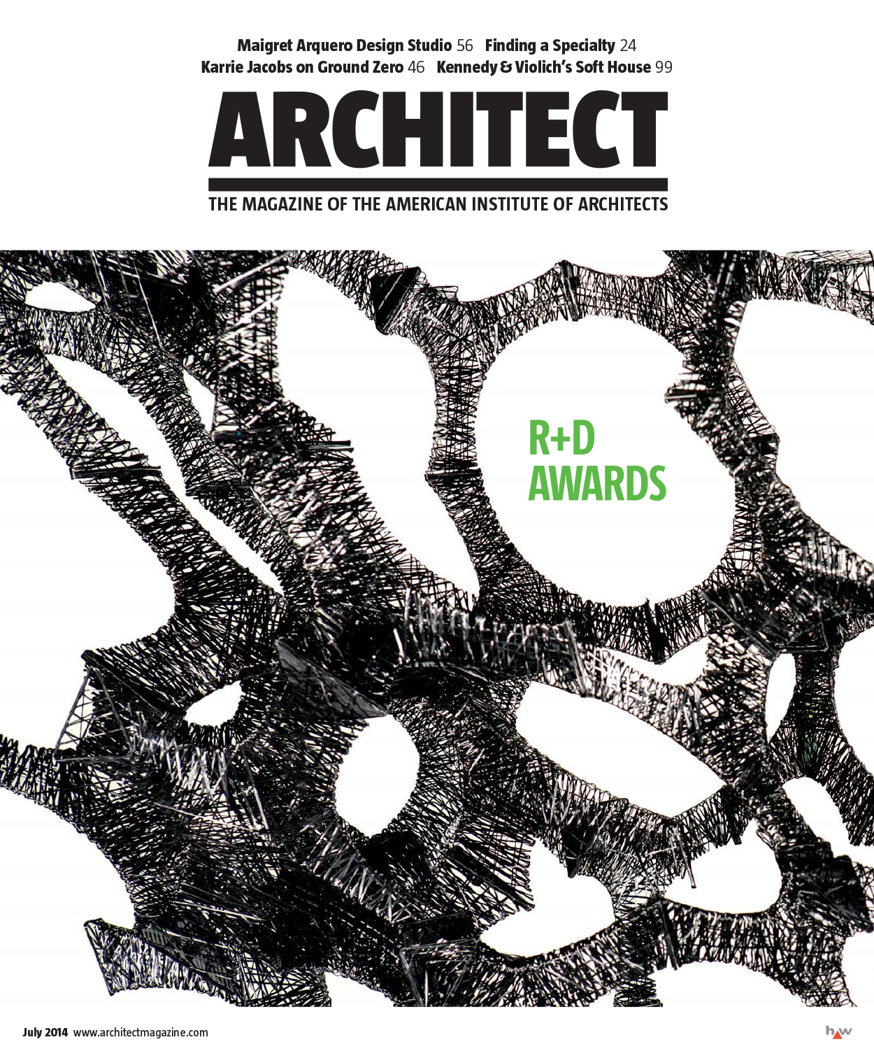
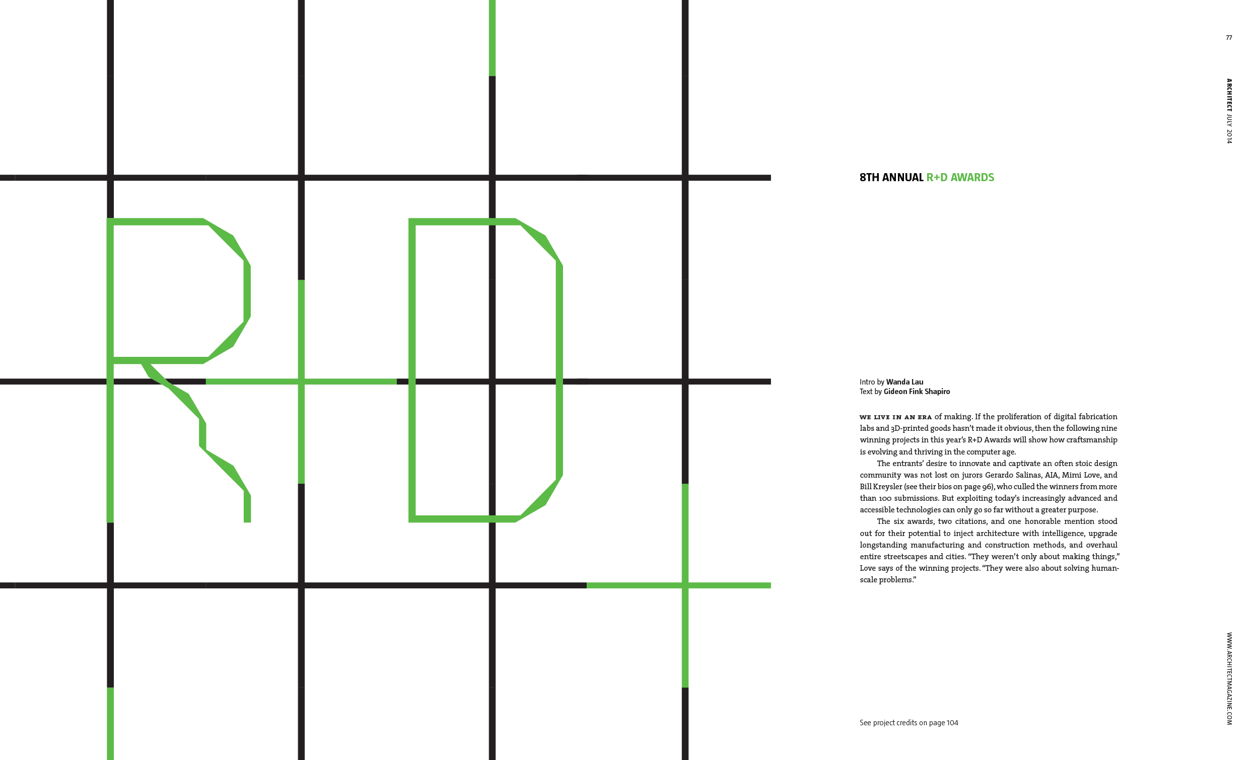
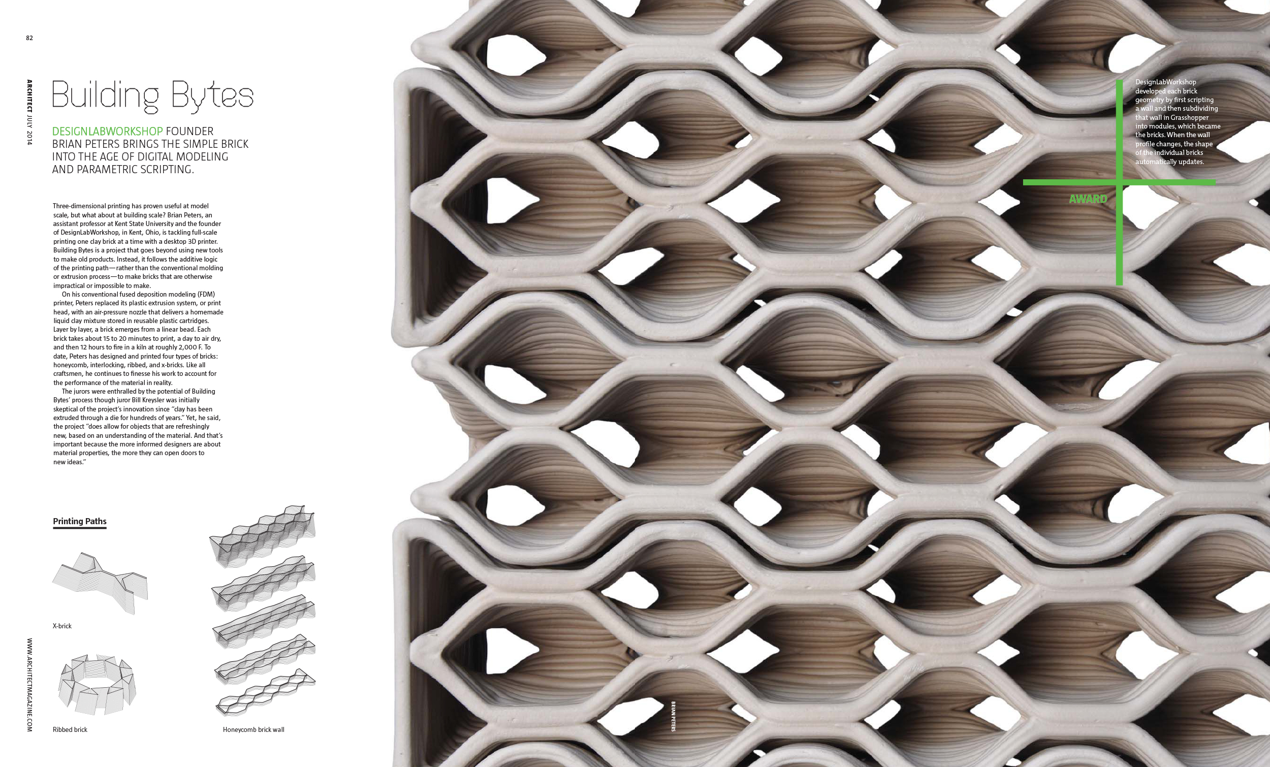
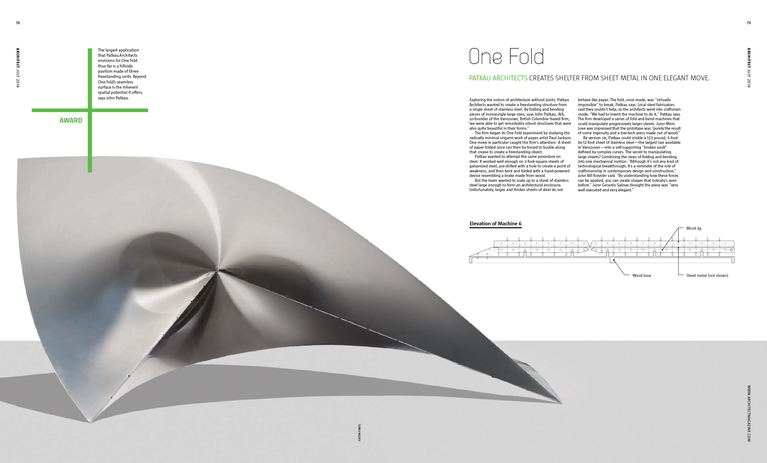
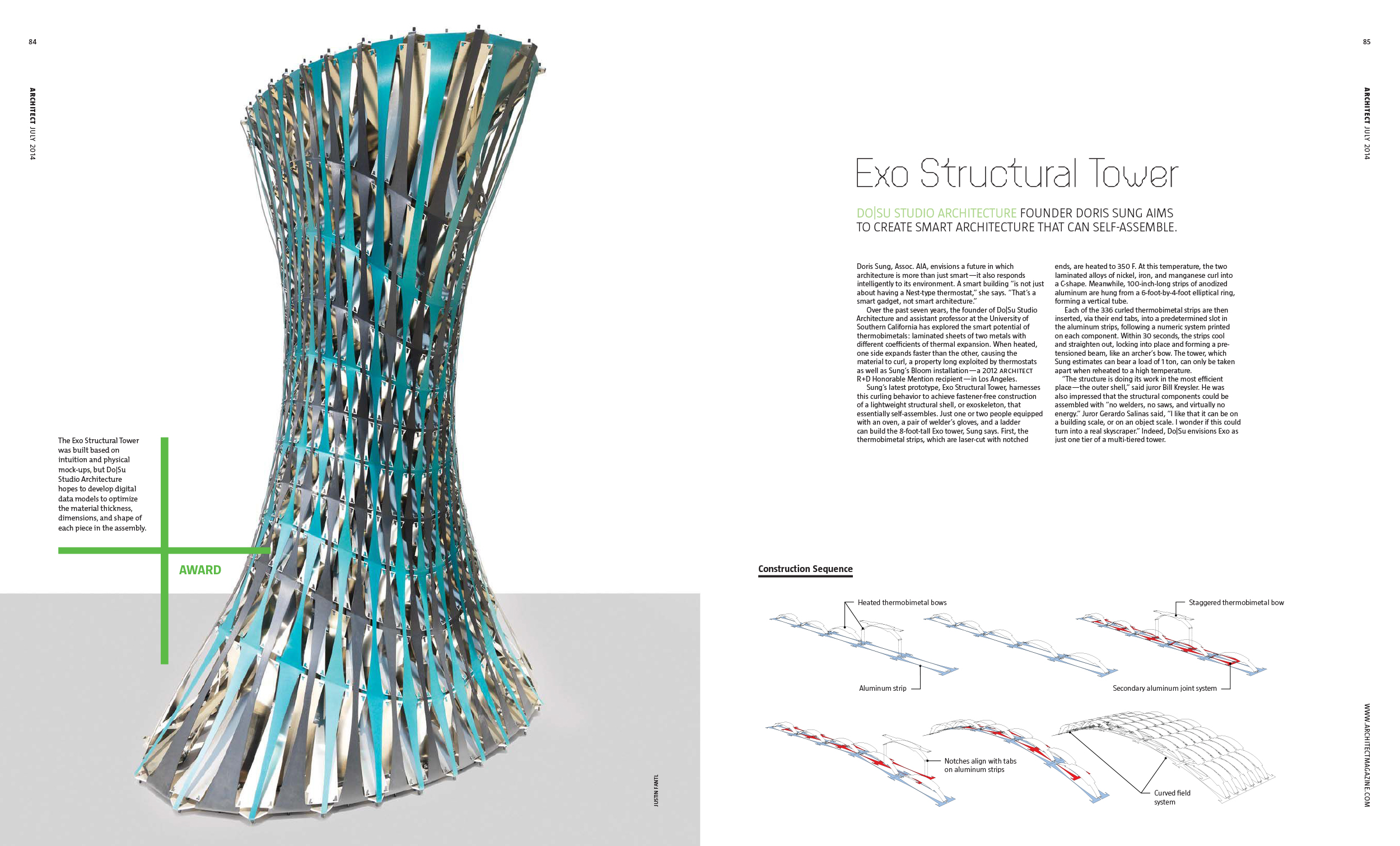
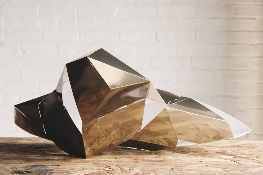
Everything gets weird in the R+D Awards. Three cheers for process and prototypes, spot inks, and more-experimental-than-house-sans lettering. An inkjet printer hacked for felt-tip markers is a personal favorite.
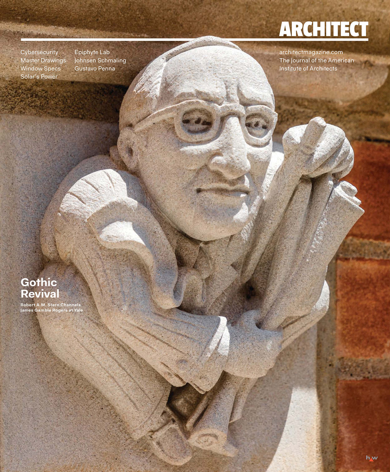
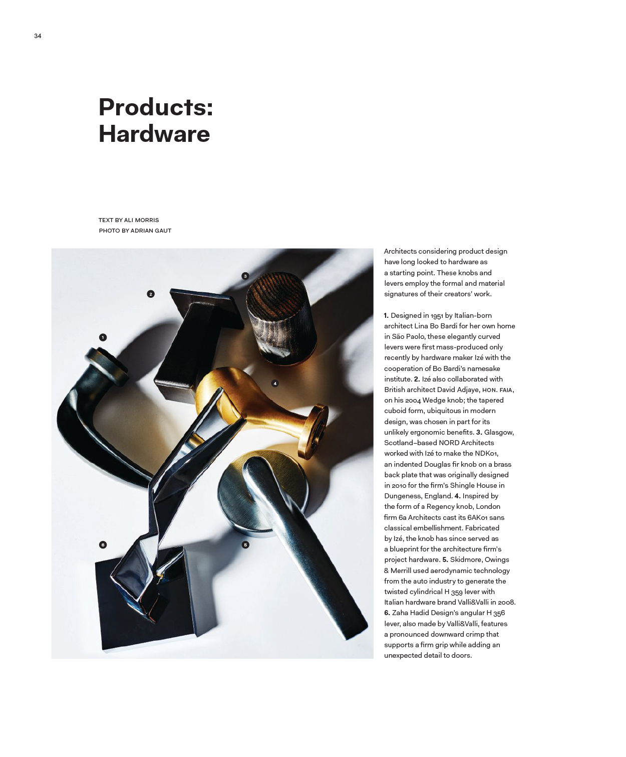
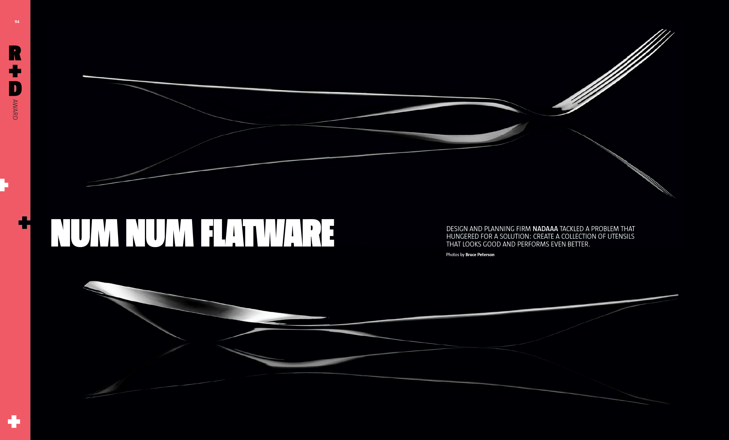
Commissioned photos by Amanda Ringstad, Alex Fradkin, Justin Fantl, and Bruce Peterson. Lettering by Ramon Carreté and Penjet.